1
2
import numpy as npimport matplotlib.pyplot as plt
1 plt.figure(figsize=(8 ,4 ))
<matplotlib.figure.Figure at 0x7f0c740ccd90>


<matplotlib.figure.Figure at 0x7f0c740ccd90>
figure创建一个绘图对象,figsize参数可以指定绘图对象的宽度和高度,单位为英寸。
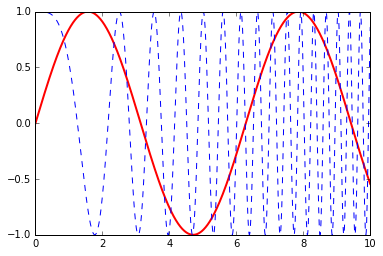
1
2
3
x = np.linspace(0 , 10 , 1000 ) y = np.sin(x) z = np.cos(x**2 )
1 2 plt.plot(x,y,label="$sin(x)$" ,color="red" ,linewidth=2 ) plt.plot(x,z,"b--" ,label="$cos(x^2)$" )
[<matplotlib.lines.Line2D at 0x7f0c73e2ea90>]
plot函数的调用方式很灵活,第一句将x,y数组传递给plot之后,用关键字参数指定各种属性:
label : 给所绘制的曲线一个名字,此名字在图示(legend)中显示。只要在字符串前后添加”$”符号,matplotlib就会使用其内嵌的latex引擎绘制的数学公式。
color : 指定曲线的颜色
linewidth : 指定曲线的宽度
第二句直接通过第三个参数”b–”指定曲线的颜色和线型。其中b表示蓝色,”–”表示线型为虚线。
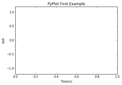
1 2 3 4 5 plt.xlabel("Time(s)" ) plt.ylabel("Volt" ) plt.title("PyPlot First Example" ) plt.ylim(-1.2 ,1.2 ) plt.legend()
/usr/lib/python2.7/dist-packages/matplotlib/axes/_axes.py:519: UserWarning: No labelled objects found. Use label='...' kwarg on individual plots.
  warnings.warn("No labelled objects found. "
xlabel : 设置X轴的文字
ylabel : 设置Y轴的文字
title : 设置图表的标题
ylim : 设置Y轴的范围
legend : 显示图示
最后调用plt.show()显示出我们创建的所有绘图对象。
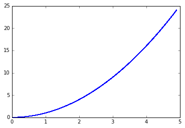
配置属性 1 2 3 4 x = np.arange(0 , 5 , 0.1 ) line, = plt.plot(x, x*x) line.set_antialiased(False )
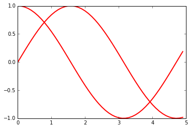
1 2 3 4 lines = plt.plot(x, np.sin(x), x, np.cos(x)) plt.setp(lines, color="r" , linewidth=2.0 )
[None, None, None, None]
调用Line2D对象line的set_antialiased方法,关闭对象的反锯齿效果。或者通过调用plt.setp函数配置多个Line2D对象的颜色和线宽属性。
1 2 3 line.get_linewidth() plt.getp(lines[0 ], "color" ) plt.getp(lines[1 ])
agg_filter = None
alpha = None
animated = False
antialiased or aa = True
axes = Axes(0.125,0.125;0.775x0.775)
children = []
clip_box = TransformedBbox(Bbox([[0.0, 0.0], [1.0, 1.0]]), Co...
clip_on = True
clip_path = None
color or c = r
contains = None
dash_capstyle = butt
dash_joinstyle = round
data = (array([ 0. , 0.1, 0.2, 0.3, 0.4, 0.5, 0.6, ...
drawstyle = default
figure = Figure(432x288)
fillstyle = full
gid = None
label = _line1
linestyle or ls = -
linewidth or lw = 2.0
marker = None
markeredgecolor or mec = r
markeredgewidth or mew = 0.5
markerfacecolor or mfc = r
markerfacecoloralt or mfcalt = none
markersize or ms = 6.0
markevery = None
path = Path(array([[ 0. , 1. ], [ 0...
path_effects = []
picker = None
pickradius = 5
rasterized = None
sketch_params = None
snap = None
solid_capstyle = projecting
solid_joinstyle = round
transform = CompositeGenericTransform(TransformWrapper(Blended...
transformed_clip_path_and_affine = (None, None)
url = None
visible = True
xdata = [ 0. 0.1 0.2 0.3 0.4 0.5]...
xydata = [[ 0. 1. ] [ 0.1 0.995004...
ydata = [ 1. 0.99500417 0.98006658 0.95533649 ...
zorder = 2
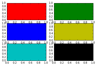
绘制多轴图 1 2 3 for idx, color in enumerate ("rgbyck" ): plt.subplot(320 +idx+1 , axisbg=color) plt.show()
subplot将整个绘图区域等分为numRows行 * numCols列个子区域,然后按照从左到右,从上到下的顺序对每个子区域进行编号,左上的子区域的编号为1。如果numRows,numCols和plotNum这三个数都小于10的话,可以把它们缩写为一个整数,例如subplot(323)和subplot(3,2,3)是相同的。subplot在plotNum指定的区域中创建一个轴对象。如果新创建的轴和之前创建的轴重叠的话,之前的轴将被删除。
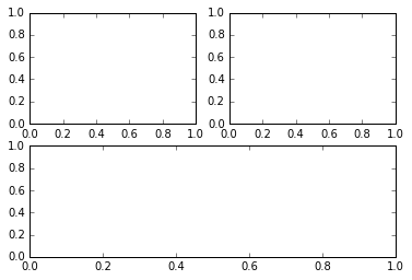
1 2 3 4 plt.subplot(221 ) plt.subplot(222 ) plt.subplot(212 ) plt.show()
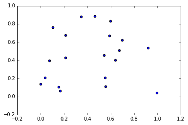
绘制散列图 1 2 3 4 fig = plt.figure() ax = fig.add_subplot(111 ) t = ax.scatter(np.random.rand(20 ), np.random.rand(20 )) fig.show()
/usr/lib/python2.7/dist-packages/matplotlib/figure.py:397: UserWarning: matplotlib is currently using a non-GUI backend, so cannot show the figure
  "matplotlib is currently using a non-GUI backend, "
http://old.sebug.net/paper/books/scipydoc/index.html